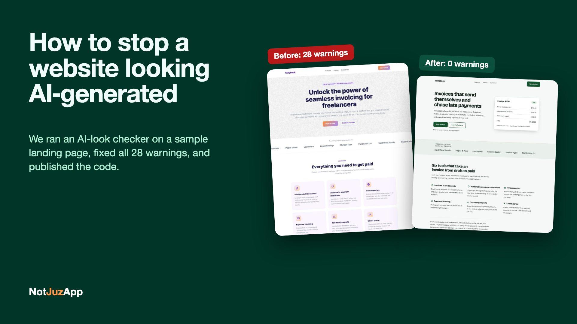
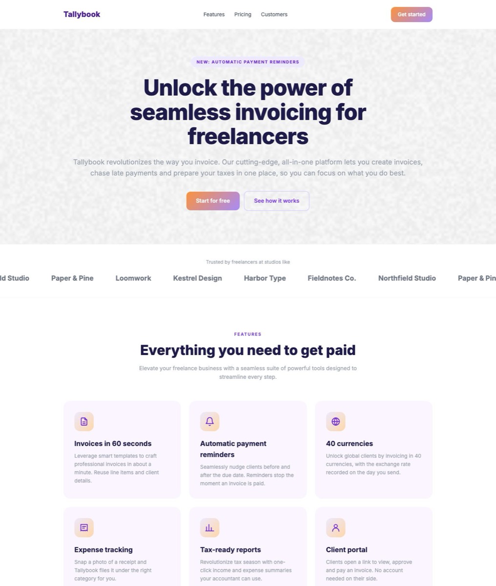
A website looks AI-generated when it repeats the layout habits AI site builders default to: a pill label above the headline, small uppercase labels over every heading, an icon in a rounded square above each card title, coloured stripes down card edges, auto-scrolling logo strips and low-contrast gradient buttons. Removing those patterns and writing specific copy fixes most of it.
To show what that means in practice, we built a landing page for a made-up invoicing app called Tallybook, deliberately using those patterns, then ran an open-source checker on it and fixed everything it flagged. Both versions are free to download or browse on GitHub, so you can run the same check yourself.
What is an AI-look checker?
It's a tool that scans a page for the design patterns that make sites look machine-made. We used Impeccable, an Apache-2.0 open-source project. Its detector has 62 rules, runs without an AI model or API key, and checks either source files or a rendered page in Chrome.
- Rendered scan:
npx impeccable detect https://your-site.comloads the page and can measure contrast, line length and what actually reaches the screen. - Source scan:
npx impeccable detect src/reads HTML, JSX and CSS files without a browser. - Privacy: turn usage telemetry off with
npx impeccable telemetry offor by settingDO_NOT_TRACK=1. We ran every scan below with it off.
What did the checker find on the sample page?
The rendered scan of the "before" page returned 28 warnings across 10 rules. The "after" page returned none.
| Rule | What it means | Before | After |
|---|---|---|---|
| low-contrast | Text below the WCAG AA 4.5:1 contrast ratio | 8 | 0 |
| icon-tile-stack | A rounded-square icon tile above each card heading | 6 | 0 |
| side-tab | A thick coloured stripe down one side of a card | 3 | 0 |
| kicker-above-heading | A tiny uppercase label above a section heading | 3 | 0 |
| line-length | Lines of text wider than about 80 characters | 2 | 0 |
| ai-color-palette | The purple-and-orange gradients AI tools reach for | 2 | 0 |
| hero-eyebrow-chip | A pill label above the main headline | 1 | 0 |
| buried-raster | A background image too faint to see | 1 | 0 |
| overused-font | A typeface used on so many sites it reads as default | 1 | 0 |
| marquee | An endlessly scrolling strip of logos or quotes | 1 | 0 |
How we fixed each pattern
Each fix kept the same sections and the same facts. The goal was a page that says something specific, not a plainer page.
Headline and labels
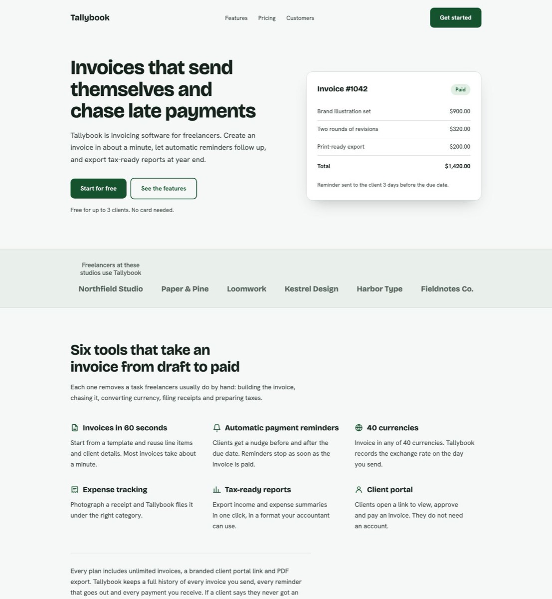
We removed the pill above the headline and the small labels such as "Features" and "Pricing" above each section. Their meaning moved into the headings themselves: "Simple pricing that grows with you" became "Pricing: free for 3 clients, from $12 a month after that".
Feature cards
The icon tile above each heading became a small icon beside it, and the cards lost their tinted boxes. Six features now read as a list a person can scan, not six identical tiles.
Testimonials and logos
The testimonials lost their orange side stripes and became plain bordered cards in a static grid. The scrolling logo strip became a single static row, so every name is visible without waiting.
Colour, type and contrast
The orange-to-purple gradient buttons failed contrast, so the buttons became a solid dark green with white text, above 4.5:1. Grey body text was darkened to pass too. Inter was swapped for Bricolage Grotesque and Hanken Grotesk, the faint background texture was removed, and paragraphs were capped near 65 characters per line.
Copy
"Unlock the power of seamless invoicing for freelancers" became "Invoices that send themselves and chase late payments". The new hero also shows a sample invoice, so the product is visible in the first screen rather than described.
What an AI-look checker can't tell you
A clean scan means the template patterns are gone. It doesn't mean the page is good.
- It doesn't read meaning. The rendered scan never flagged "Unlock the power of seamless invoicing". The source scan caught one marketing buzzword, but neither can tell whether a claim is true or a link goes to the right place.
- The two scans see different things. The source scan missed the headline pill and the long lines, which only show up once the page renders. Run both.
- Some rules are judgement calls. A label above a heading isn't always wrong. Treat the output as a list to review, not a score to chase.
Download the sample project and run it yourself
The project is plain HTML and CSS with no build step, under the MIT licence. Download the zip or clone it from GitHub, then run:
python3 -m http.server 8765from the project folderDO_NOT_TRACK=1 npx -y impeccable@4.8.1 detect http://localhost:8765/before/DO_NOT_TRACK=1 npx -y impeccable@4.8.1 detect http://localhost:8765/after/
You need Node.js and Chrome installed. Our raw results are in the project's results folder. To check your own site, point the same command at its URL, or add --github in a GitHub Actions job so findings show up on pull requests.
Need a hand?
We use AI to build faster, and we check what it produces before a client sees it. If your site or app looks like every other template, our UI/UX design and web application teams can review it and fix what matters, or you can start with a fixed-price job on how we work.